Katy Krider Interior Design is a full-service interior design studio serving the greater Portland area. Katy’s passion lies in the creation of spaces that reflect beauty, function, and craft with the highest level of client service. She believes in a collaborative approach to design - listening carefully and responding thoughtfully to create a unique design solution that reflect her clients’ vision and exceeds their expectations. For a list of completed residential and commercial projects please see the experience page. For recently completed projects click on each image below.
To discuss your project, please contact Katy at 503-341-8506.
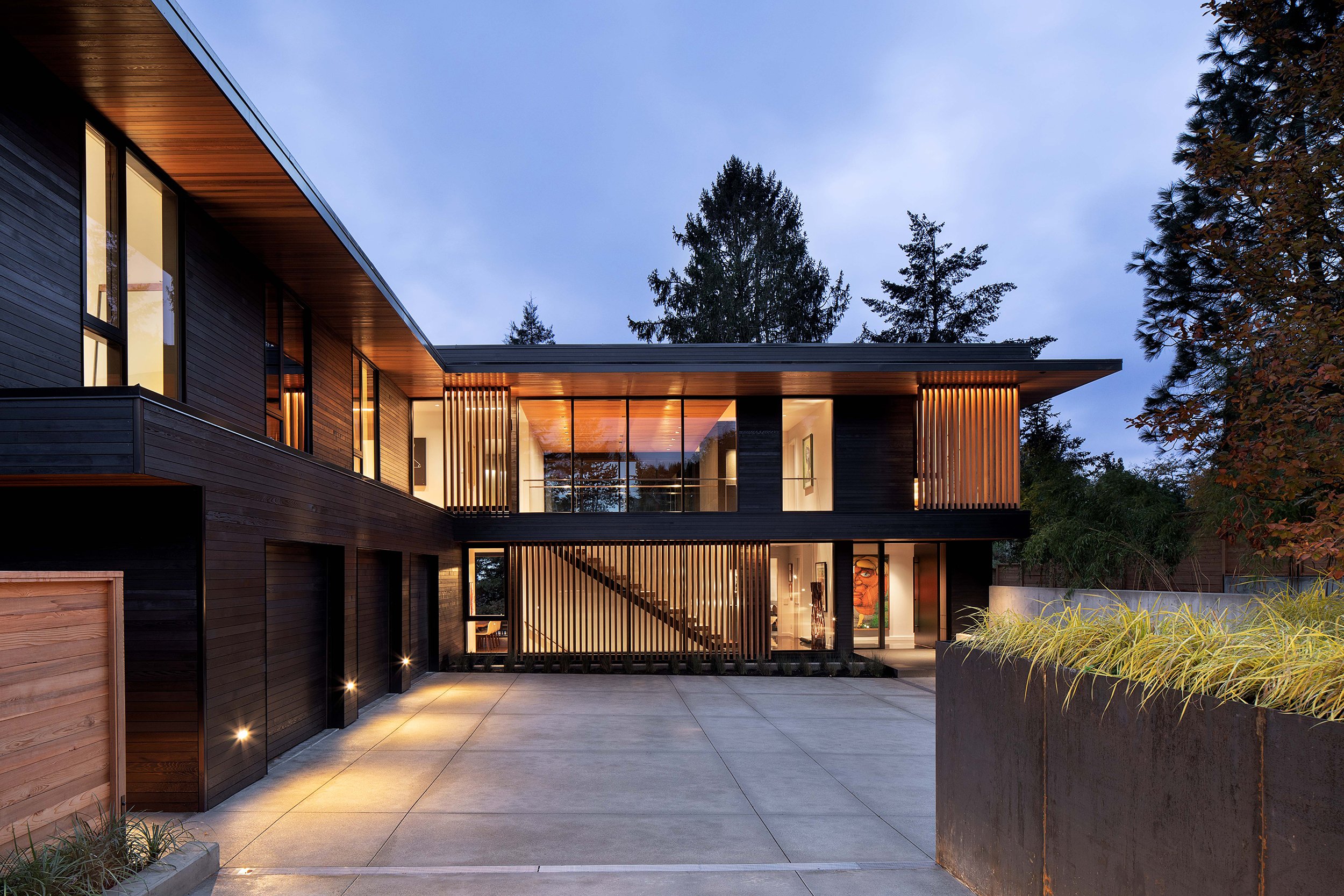
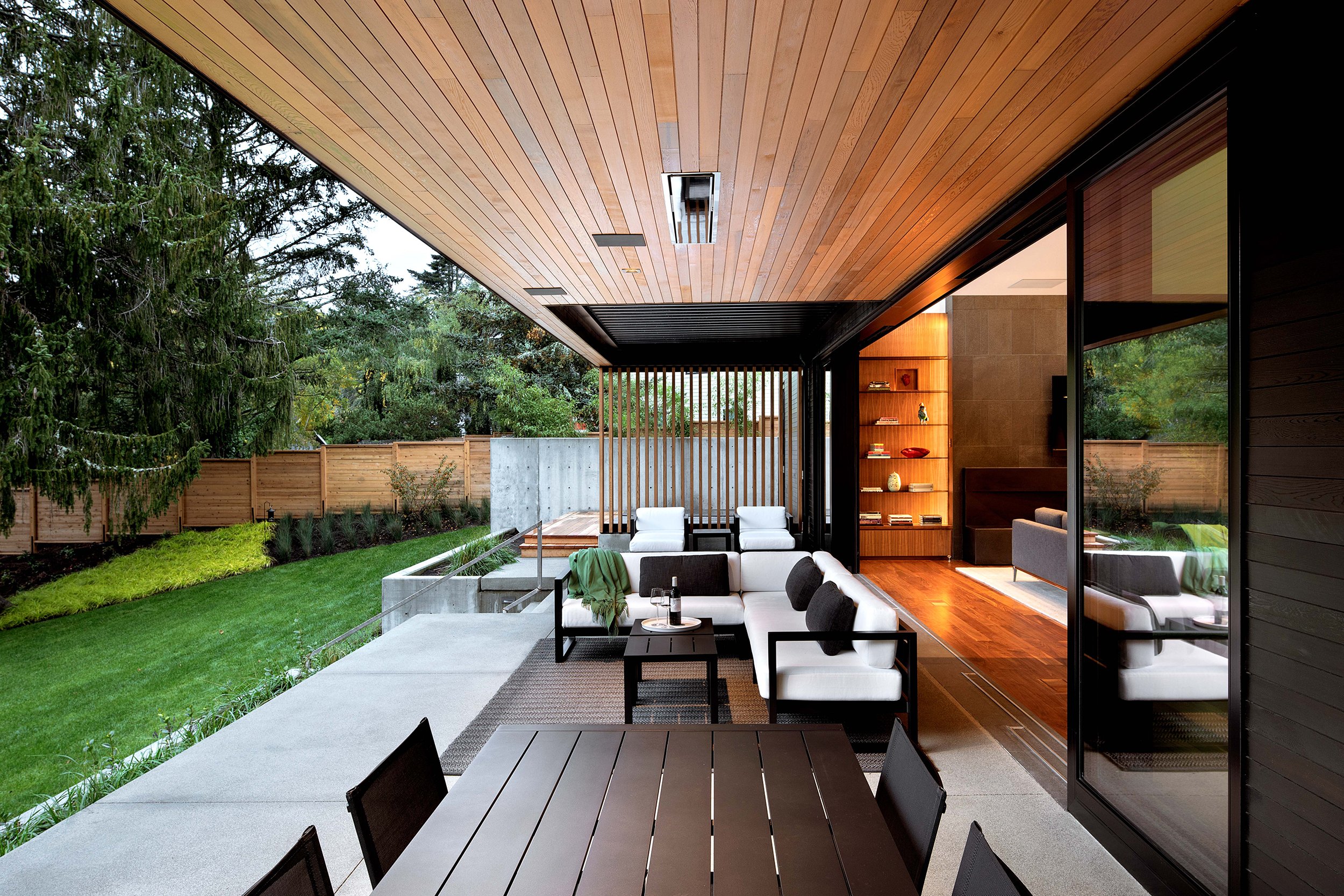
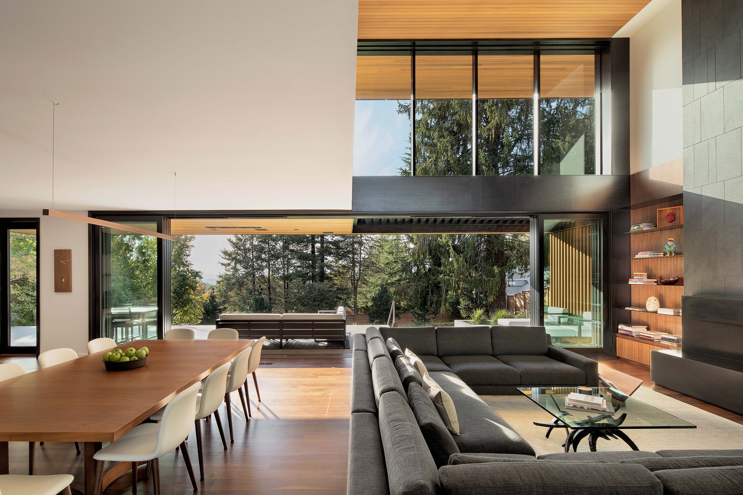
The Maplerock Residence is a new classic of Northwest Modernism. Katy Krider Interior Design led the interior architecture and design of this three-story, 4700 square foot home. Completed in 2021, it is nestled on the west side of the northwest hills of Portland with a panoramic view of the coast range. Both the exterior and the interior spaces and palette of materials are a study of proportion, contrast and texture.
The client’s vision for the interior design was inspired by the artwork they have collected and the places they have spent memorable moments over the years. The restrained interior material palette was chosen as a canvas to curate their colorful works of art and objects throughout the home.
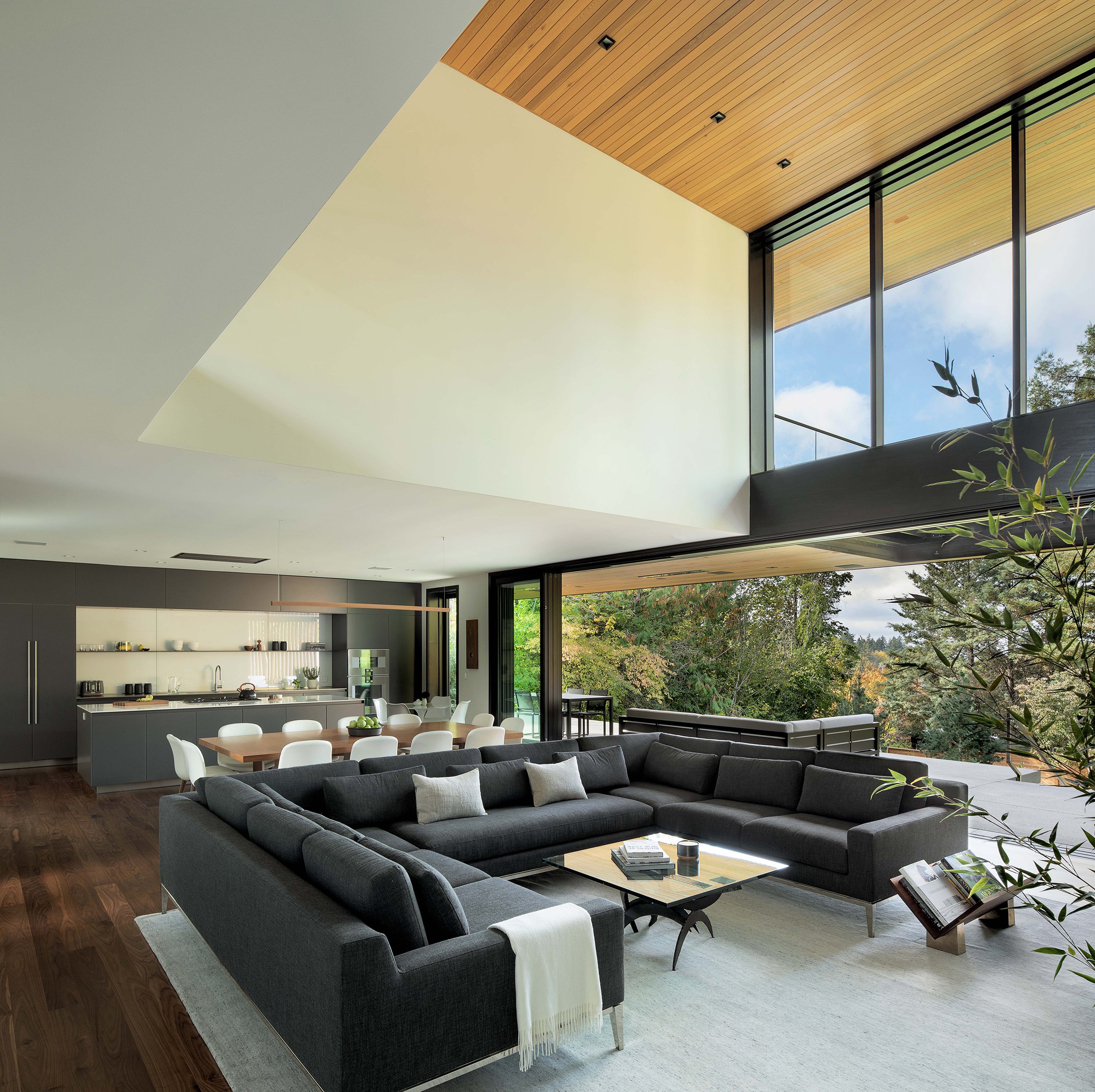
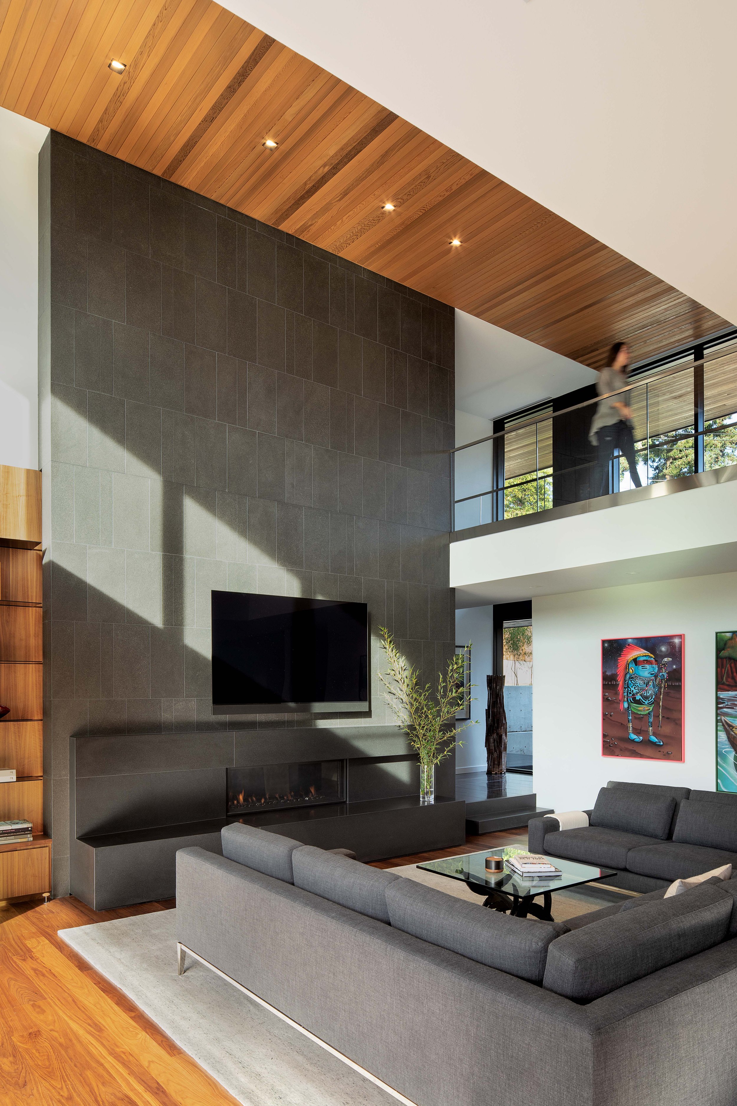
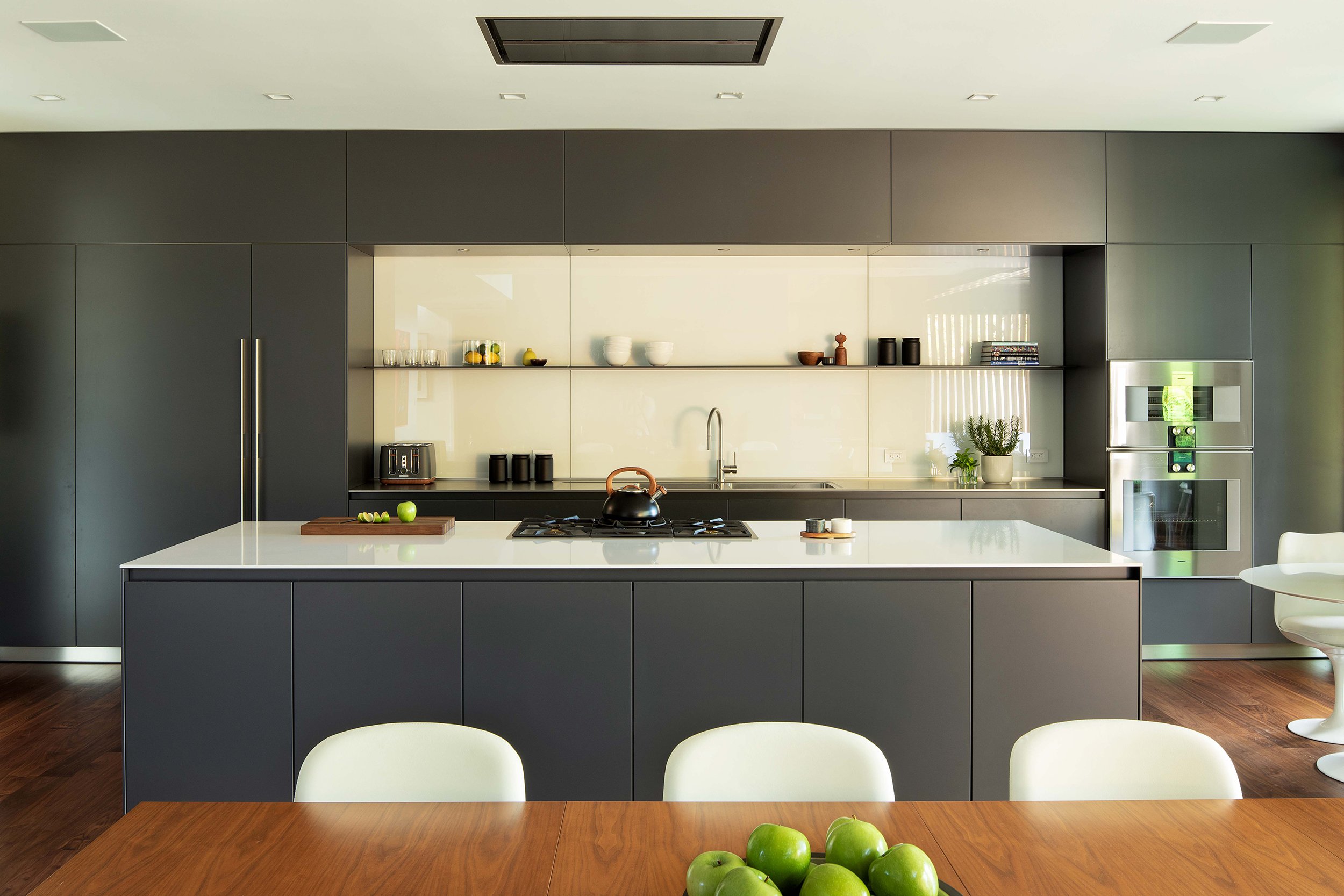
The heart of the home is a light filled, two-story living space open to the dining room and kitchen. The space also opens up on the west side to the outdoor living space through a thirty-two foot telescoping sliding door. The honed black granite fireplace hearth and flamed black granite chimney surround anchor the room on the north end. A custom Bulthaup kitchen balances the south side of the room. Also on the main level is the entry foyer, music room, powder room and pantry.
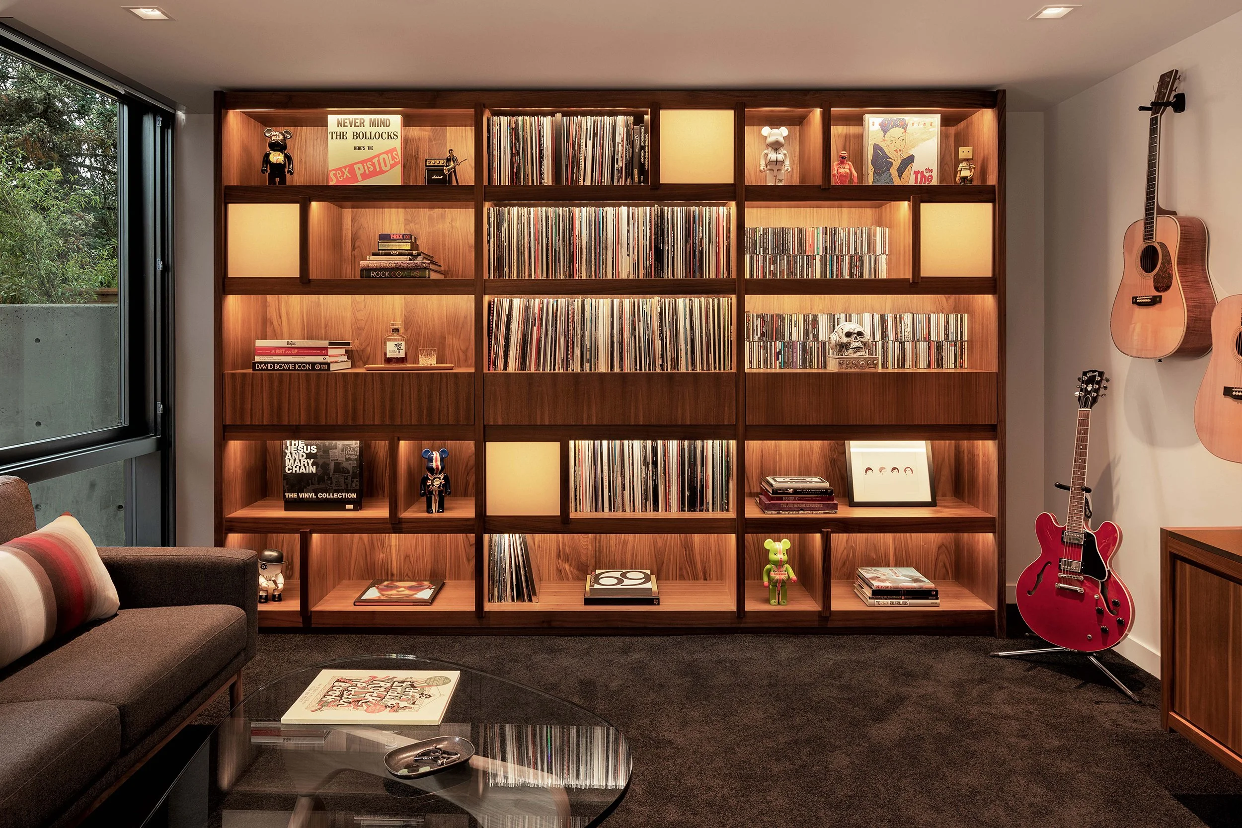
The lounge-like, laid back music room was designed as a listening, performing and learning space. The custom casework was carefully designed to accommodate the client’s vast collection of vinyl records, CD’s, books, objects and instruments. Design elements inspired by the client’s travels to Tokyo were integrated into the casework design.
A gorgeous stair of floating solid walnut treads leads to the second level of the home. The master suite, three en-suite guest rooms, laundry and personal studies all reflect the modern and minimal approach to the interior design enriched by the client’s artwork and furnishings. The basement level provides room for a sauna, exercise room and lounge.
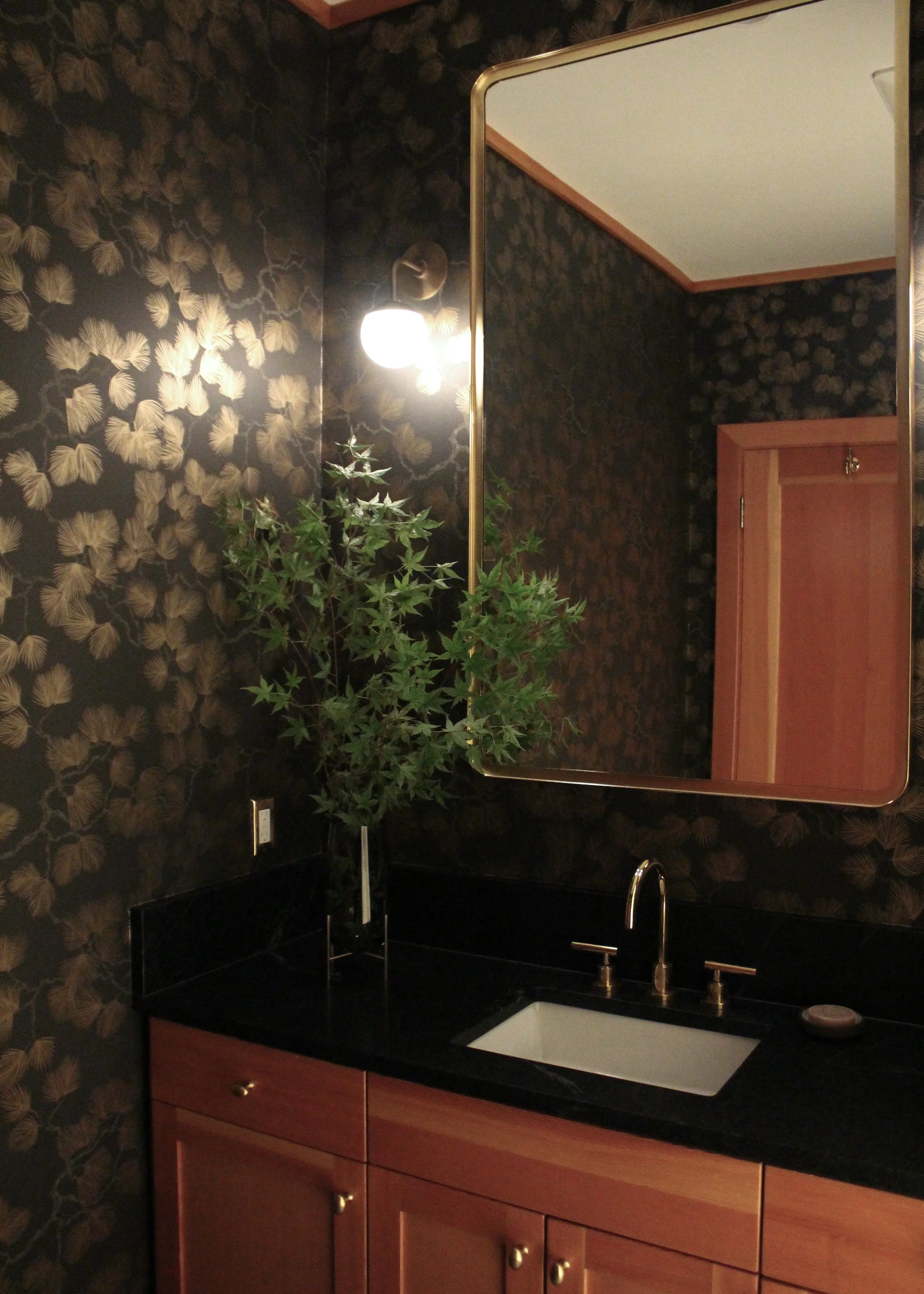
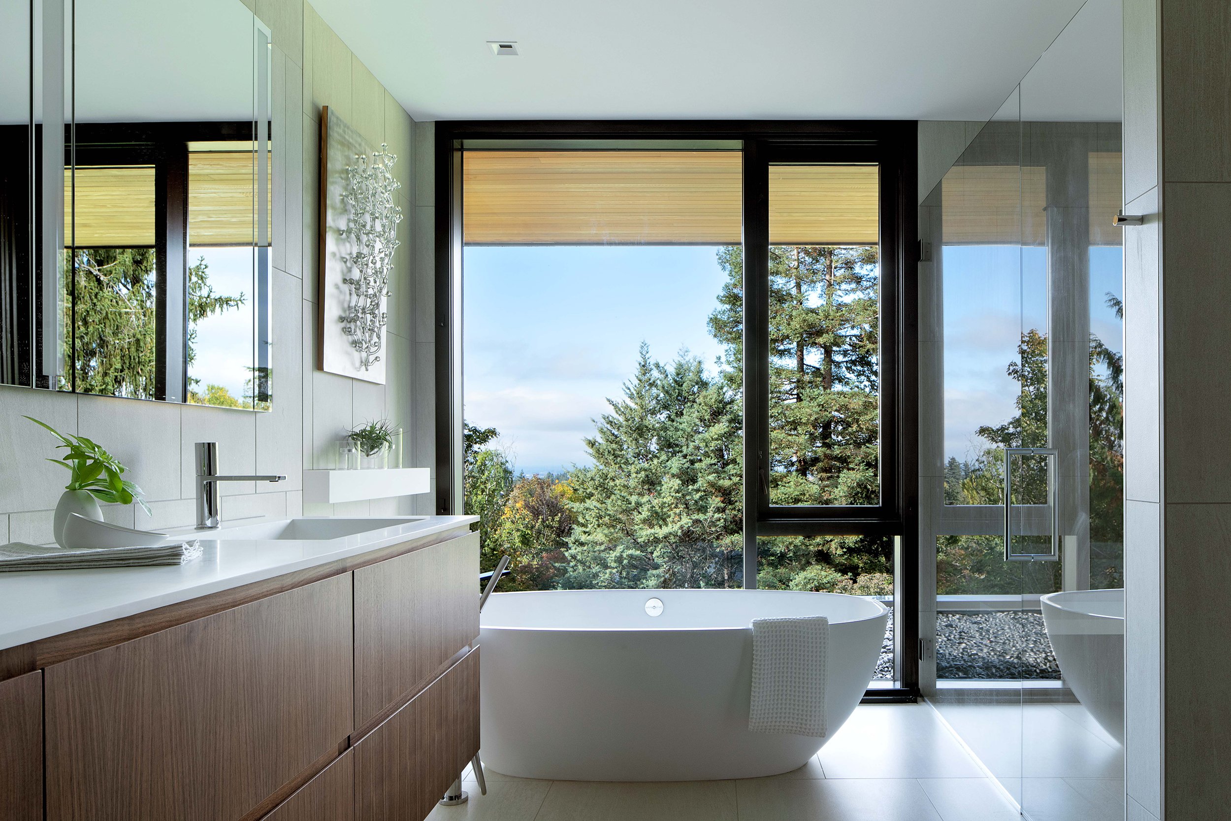
The interior detailing throughout was intentionally minimal, modern and restrained. The custom casework throughout the home was faced with American Black Walnut quarter sliced veneer with integrated pulls. The powder room and master bath have custom solid resin counters with integral sinks. In cool contrast, all of the plumbing fixtures and accessories were selected in polished chrome while the door hardware is brushed chrome.
Many of the client’s furnishings were carefully integrated into the floor plans, while new pieces were selected to compliment their new home and lifestyle.
Katy Krider Interior Design, Interior Design
Scott Edwards Architecture, Architect
Hamish Murray Construction, General Contractor
Biella Lighting, Lighting Design
Shapiro Didway, Landscape Architect
Protech, Home Integration
Conrad Stonecutter, Stone work
Campbell’s Tile Concepts, Tile
On The Level, Custom Casework
Bulthaup North America, Kitchen
Kush Rugs, Custom Rugs
Jeremy Bitterman, Photography
Chown Hardware, Plumbing fixtures and Hardware
The LO / MCM was a labor of love.
The house is a one-level, 1,850 square foot mid-century home built in the early 1960’s in Lake Oswego, Oregon. It was designed and built by a local builder for his family. Sadly - over the years - it had been stripped of it’s original character.
Fortunately, my client’s saw a diamond in the rough and are passionate about architectural restoration and historic preservation! They purchased the home in 2016 after spending years restoring a beautiful 1907 Foursquare Craftsman in the Hollywood neighborhood in Portland. With a little research they were able to attain the original blueprints for the home as well as photographs provided by the family who originally built it.
When they brought KKID on board their vision was to restore the primary living spaces including the Kitchen, Living Room, Family Room and Dining Room to the home’s original layout, look and feel.
Looking at the original drawings and photos there were three mid-century elements that were essential to restore: A mahogany framed translucent screen wall that divided the entry and living room from the Kitchen, Dining and Family Room; a double sided stacked stone fireplace and a full height casework wall which separated the Kitchen from the Family Room.
The material palette was restrained - re-introducing the enveloping warmth of ribbon cut Sapele Mahogany for cabinetry, wall paneling and the screen wall. The original house had terrazzo flooring, but after reviewing the options, we chose cork for it’s warmth and acoustic properties. The new casework wall separating the Kitchen from the Family Room provides display shelves and discrete storage in “hidden” drawers and cabinets.
Katy Krider Interior Design, Interior Design
Wiley’s Marble Restoration
Original Drawings and Photo provided by client
The Nob Hill Oasis is a unique, warm and soulful retreat - transforming a utilitarian bathroom into a special space reflecting my client’s sense of fabulous taste and passion for design.
To organize the room it was separated into two zones - wet and dry. The “wet zone” with shower and soaking tub, is open to the “dry zone” defined by a graceful archway echoing the shapes of the masonry windows seen through the windows. To provide privacy and a bohemian touch, plants were hung in front of the windows surounding the shower and soaking tub. Using the Schluter Weti system, in floor heat was installed in both the wet and dry zone! The plumbing fixtures were Gessi and Kohler, provided by Chown.
The warm, textural palette was inspired by one of my client’s pieces of art as well as the Makelike, Drift wallpaper pattern and Zellige tile she had discovered from Cle.
The palette was woven together, after discovering remnants of the most beautiful Rosa Portugal marble slabs in a barn in Oregon wine country! Artistic Stone Design transformed the remnants into a custom floor tile pattern, arch and window surrounds.
Katy Krider Interior Design, Interior Design
H.E.L.P. Group, General Contractor
Artistic Stone Design, Tile and Stone
Chown Plumbing, Plumbing Fixtures
Makelike, Wallcovering
Rejuvination, Hardware
The Dunthorpe Residence is a beautiful home built in the 1980’s in the Shingle Style reminiscient of Robert AM Stern’s early residences. The home was originally designed for the client’s young and growing family. Today, as retired ‘empty nesters’ who also enjoy entertaining - the client wished to embark on a full renovation of the home.
Beginning in 2013, while working for Skylab Architecture, I led the interior design team to renovate their formal dining room and living room into a private eight seat movie theatre and lounge.
In 2017, the client hired Katy Krider Interior Design to re-design the remainder of the house. The client’s vision was to transform the house from a more traditional interior to a more contemporary, transitional aesthetic. The scope of work involved a full kitchen and powder room renovation as well as converting three existing bedrooms to guest rooms with ensuite bathrooms. The client was inspired by a clean, light minimal color and finish palette consistent throughout the home.
The footprint of the kitchen remained the same with an island anchoring the center of the kitchen but existing column and walls were removed to create a more open, airy feel and visual connection to the dining space. The driving material in the kitchen was the cream colored Luna Quartzite used for counters surfaces and full a height backsplash. All new appliances were Sub-zero Wolf
Katy Krider Interior Design led the interior architecture and design scope of work with Tomas Greissmann as General Contractor. Pacific Design Inc. Custom Cabinetry. Photography by Sally Painter Photography. Stone fabrication by De La Tierra PDX.
The King’s Hill Residence is also known as the WR Mackenzie Residence and is on the National Register of Historic Places and located in the historic King’s Hill neighborhood of Portland, Oregon. The home is a classic architectural example of the Federal Style, designed by the prominent Portland architectural firm of the day, Whidden and Lewis. Prior to being placed on the National Registry of Historic Places in 1978, the house had undergone a significant two-story addition on it’s SW side and a few unfortunate interior renovations. The house felt dark, dreary and mostly disregarded on the interior.
My client, relocating from Northern California, fell in love with Portland and had been looking for a home that was within walking distance of all of Portland’s finest amenities - Downtown, Northwest 23rd, the Pearl District and Washington Park. They purchased the home with the vision of lovingly restoring it while also respectfully renovating the interior to support the needs of a modern family.
The house is approximately 6000 square feet with three stories of living space and a previously unfinished basement. The main level has a traditional formal Entry Foyer with flanking Dining Room and Living Room at the front of the house with a Library, Family Room, Kitchen and original Butler’s Pantry located on the west side of the main level. The second level includes a Master Suite, Sun Room, Dressing Room and two guest rooms with shared guest bath. The third level, originally the servant’s quarters, were mostly unfinished and in disrepair, as was the basement.
With the client’s program and functional needs defined, Katy began the design process by studying a wide range of floor plan options for all three levels while also focussing on retaining, enhancing and also restoring the historic character and details of the home. Once the floor plans had been refined Katy, working closely with her client, designed, selected and specified the palette of interior materials, cabinetry, architectural details, lighting, hardware and windowcoverings throughout the home. All of the systems incuding HVAC, plumbing, electrical and structural were also replaced throughout the home.
Katy Krider Interior Design collaborated with a talented and professional team of consultants including Olson and Jones Construction, Jeffrey Miller Architecture, Full Circa Restoration, Earl Levin Lighting Consultant, Westside Electric, Hood-McNees Mechanical, Heritage Woodcraft, Young and Son Woodworks, Joshua Durand Tile Work, De La Tierra Stoneworks, Sundeleaf Painting, Kip’s Hardwood Flooring, The Shade Store and Christiane Millinger Rugs.
Fantastic Federal architectural details!
The King’s Hill Residence is also known as the WR Mackenzie Residence and is on the National Register of Historic Places and located in the historic King’s Hill neighborhood of Portland, Oregon.
WR Mackenzie House Circa 1900. Photo courtesy The Oregon Historical Society.
View from the Kitchen through the original Butler’s Pantry to Dining Room. Photography by Blackstone Edge.
Period appropriate interior finishes and details throughout the house
The original claw foot tub - refurbished and installed in the Master Bath
This young family of four wanted to transform the main level of their home in the Forest Heights neighborhood to be a bright, open and airy space that would become the heart of their home! Their influence was a classic take on the modern farmhouse style.
The palette of materials included Pental quartz countertops with a herringbone Pental, Genesi ceramic tile backsplash. The flooring throughout the main level is D & M Casa wide plank French Oak. To contrast with the light palette, the decorative lighting and hardware was selected in oil rubbed bronze and from Rejuvination. The farmhouse sink is Kohler. Appliances are Sub Zero / Wolf.
The scope of the project will be completed in two phases; phase one was the kitchen, nook and adjacent family room. Phase two will include the dining room, living room, foyer, study, mud room and powder room.
General Contractor, Ostmo Construction
Cabinetry, Spear Design
The “Before” image of the Kitchen.
The ‘Before’ image of the Family Room.
This project was a renovation of a turn of the century building in the heart of the historic Mission District in San Francisco. The existing ground floor space was renovated to become the home of The Civic Kitchen - a recreational cooking school.
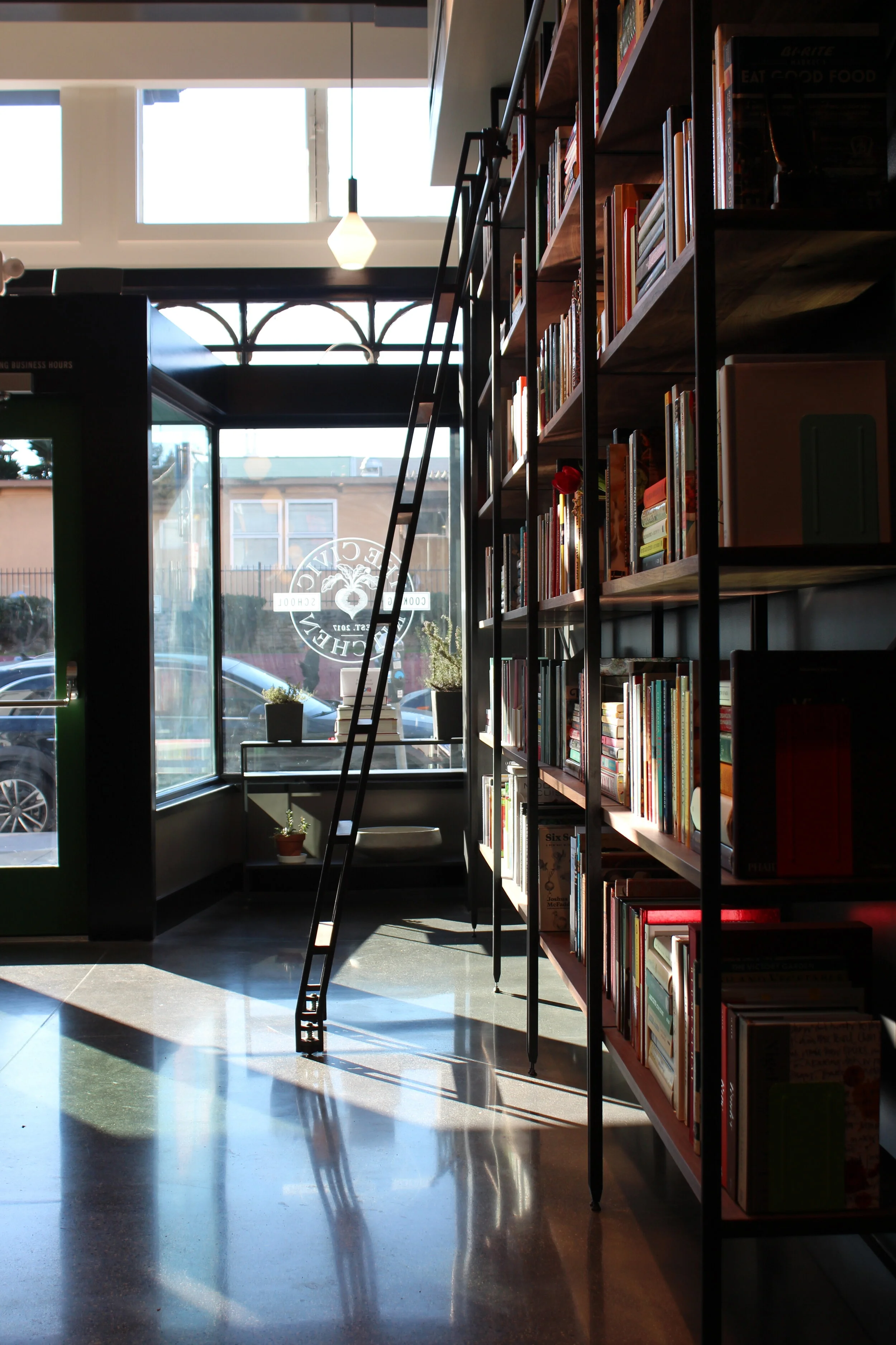
The client’s vision was to create an inviting learning space where students can take a range of culinary classes in a state of the art kitchen. Following every class students gather at a communal dining table to enjoy their culinary creations together. Open to the entry and dining space is a beautifully crafted bookcase that houses the client’s ever-evolving cookbook collection.
The palette of materials included polished, stained concrete floors and Carrara marble counters contrasted with beautiful San Francisco made Heath ceramic tile for a continuous herringbone backsplash. Black walnut and blackened steel was introduced to add a natural warmth, contrast and texture. The layered lighting approach balances both an array of decorative pendants by Cedar + Moss with focused task lighting throughout the space.
Our studio led the interior design scope of work among a talented team of consultants including:
Charles Hemminger, Architect
Angotti + Reilly, General Contractors
David Baker, Custom Casework
NRF Studio, Signage and Branding
Branding and blade sign by NRF studio
The Civic Kitchen entry on historic Mission Street. Photo courtesy of The Civic Kitchen.
The custom Walnut and rolled blackened steel library wall holds an ever growing colorful cookbook collection.
The communal table - a place to gather together to savor your culinary creation with new friends.
Class is in session! Photo courtesy of The Civic Kitchen.
Movable custom work tables of Carrara marble and steel anchor the culinary classroom creating flexible configurations for each class or event.
Grand entrance! Artistic Tile, Motor City marble stone mosaic greets you as you enter.
Early Palette Concepts
The “Before” shot. Construction was a complicated endeavor!
Colorful sidewalk markets of the Mission District
Vibrant murals of the Mission District
The Alameda Bathroom renovation transformed an existing un-usable space into an elegant and modern full bath. The house, an English style bungalow built in 1929 in the Alameda neighborhood of NE Portland, retained the original unpainted solid gumwood doors and architectural mouldings in the adjacent Living Room and Dining Room. Katy Krider Interior Design introduced Khaya veneer on the custom floating vanity and mirror to visually connect the two spaces and add warmth and sophistication to the bathroom. The floor is a grey basketweave limestone mosaic from Ann Sacks while the shower is framed with large format Calcutta marble tile and a coordinating mosaic tile. The wall mounted floating sink by Duravit adds a modern and clean look to the space.